

The FluentBoards Reports Dashboard: How to Actually Read Your Team’s Week


You’re running four active projects. Eight team members are spread across all of them. And your most reliable way of knowing how things are going is to ask around.
That’s not management: that’s hoping everyone remembers to tell you what matters.
The FluentBoards Reports Dashboard changes the equation. In one place, updated in real time, you get:
- Completion rates by project
- Task distribution by team member
- Overdue counts
- A full project activity log
The core reports are on the Free plan, so no upgrade is required to stop guessing and start seeing.
This guide walks through each report, how to filter for specific questions, and how to build a ten-minute Monday routine that makes every week easier to run.
Let’s dive in!
The Reports Dashboard vs My Tasks: Two Different Lenses
One distinction worth making from the start: the Reports Dashboard is not the same as the My Tasks dashboard.
- My Tasks is your personal view. It shows what’s assigned to you across every board, organized by tab: Today, Overdue, Upcoming, Mentioned. That’s your daily individual triage.
- The Reports Dashboard is the team-wide view. It shows how your entire team is moving, across every project, every assignee, every stage.
These two are built for different moments. My Tasks is what you check at 9am to plan your own day. Reports is what you check on Monday before assigning anything new to anyone.
You access the Reports Dashboard from Reports, in the top navigation bar or the FluentBoards menu in the WordPress admin sidebar.
Three core reports come with the Free plan: Overview, Tasks, and Activity. Here’s what each one is actually for.
Overview: Spot Who’s Overloaded Before the Week Starts
The Overview report is the first tab you should open. By default it shows data across every board, though you can narrow it to one using the filter covered below.
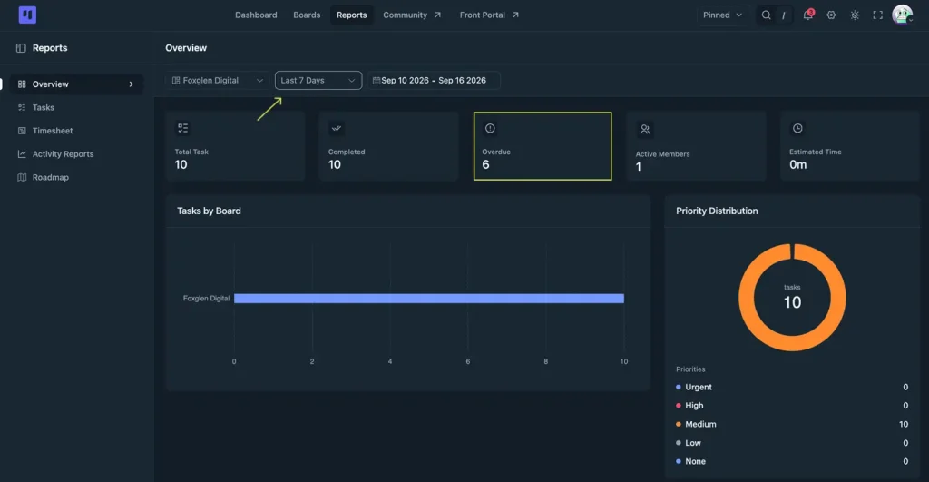
Right at the top are five stat tiles:
- Total Task, everything currently on the board or boards in view
- Completed, how much is actually done
- Overdue, tasks past their due date right now
- Active Members, how many people are carrying work
- Estimated Time, total hours estimated across open tasks
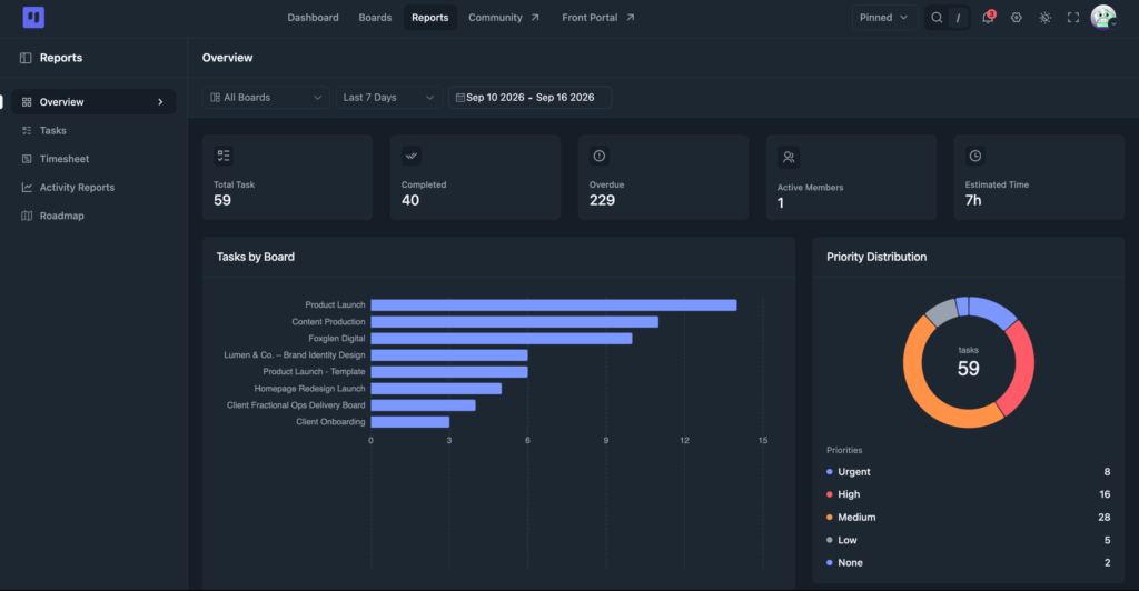
Scroll down and the rest of the report unfolds:
- A Tasks by Board chart alongside a Priority Distribution breakdown
- A Task Completion Chart alongside a Due Date Distribution chart
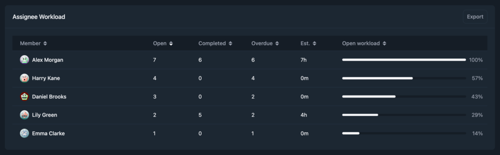
- An Assignee Workload table at the bottom, with its own Export button
The completion rate tells you the obvious thing, how much is done versus how much is open. But the panel that tells you the most is the workload table.
When one team member has 21 tasks assigned and another has 6, that’s not a personality difference, it’s a scoping failure somewhere upstream. Someone defaulted to the same assignee, or added tasks without checking the existing load.
Either way, the workload table makes the imbalance visible before someone misses a deadline because they were silently underwater. Look at it before you assign anything new this week. If someone’s already heavy, the question isn’t whether they can handle one more. It’s which of their existing tasks should move, get pushed, or get closed.
The overdue count works the same way, surfacing a symptom rather than a verdict. A high total usually means one of three things:
- Tasks were scoped to unrealistic deadlines
- Something upstream stalled and nothing downstream was adjusted
- Tasks fell off someone’s radar entirely
The Due Date Distribution chart breaks that number down further, and the Assignee Workload table tells you whose it is. What you do about it happens in the board.
Tasks: Where Your Work Is Piling Up
The Tasks report breaks your work down two ways at the top:
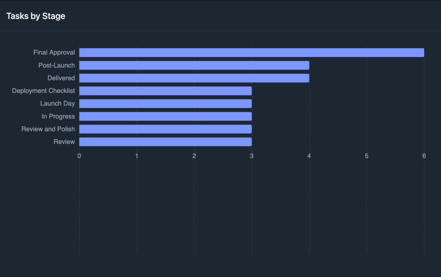
- Tasks by Stage, showing how many tasks sit in each column across your boards
- Tasks by Assignee, showing per-person workload
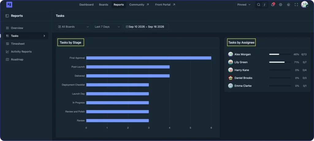
These are distribution charts, not a filterable list of individual tasks. That changes the question they answer:
- A board’s task list tells you what status task X is in
- The Tasks report tells you where work is backing up
If Content Editing holds three times as many tasks as every other stage, that’s a bottleneck you can see before it becomes the reason the whole board stalls.
The most practical use case: preparing for a project review, a sprint close, or a 1:1. Before you sit down with a team member, set the date range to the last two weeks and find their name in Tasks by Assignee. You’ll see what they’ve completed, what’s still open, and what’s overdue, without asking them to summarize their own week. That’s a better conversation. It’s also more respectful of their time.
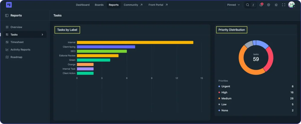
Below those sits Tasks by Label, with its own Priority Distribution alongside it. Useful when your labels carry real meaning, since it tells you which type of work is taking up the most room and how urgent that bucket actually is.
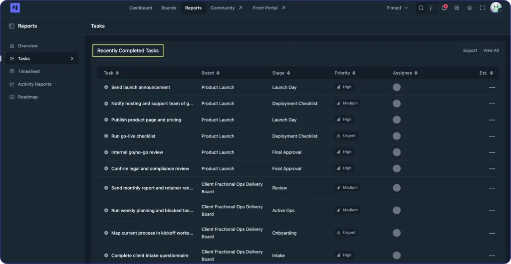
At the bottom is a Recently Completed Tasks table, a straight list of what’s been closed out with the board, stage, priority, and assignee for each one, sortable by any column. Export it when you need a completed-work log for a status update or client report, or hit View All for the full history instead of just the most recent entries.
Activity: The Project Log That Maintains Itself
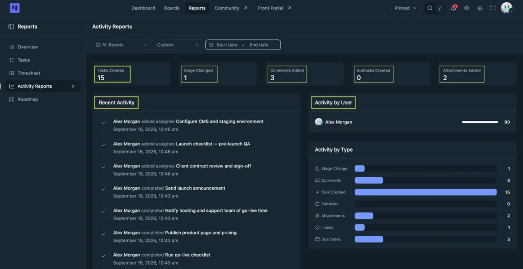
The Activity report opens with five stat tiles:
- Tasks Created
- Stage Changed
- Comments Added
- Subtasks Created
- Attachments Added
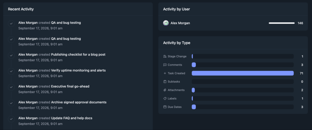
Below them sits a real-time log of everything that happened across your project: who moved a task to a new stage, who changed an assignee, who updated a due date, who added a comment, and exactly when.
Most teams don’t have this. They have a chat thread where someone posts “moved the homepage redesign to QA” and three weeks later nobody can find it.
The Activity report solves a specific management problem, knowing what happened without having to ask. That’s useful for status updates, where you need to say what moved last week and what’s still open.
It’s especially useful when something goes wrong and you need to reconstruct the sequence of events without interrogating the team.
The log also handles distributed work quietly. When your team spans time zones, it tells you what happened while you were offline, so there’s no catch-up call needed.
Alongside the feed, Activity by User breaks the same data down per person, so you can see at a glance who’s been most active on the board this period rather than just what happened.
Filtering the Dashboard
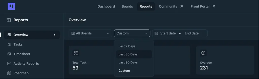
Every report shares the same filter bar: a board selector and a date range, with quick presets like Last 7 Days or a custom range.
By board: Narrows all three reports to a single project. Use this when you’re checking the health of one client engagement or one product initiative rather than your entire workload.
By date range: Limits data to a set period. Set it to the last two weeks before a sprint review, or the last 30 days before invoicing a client. The more useful application is comparison: run a report for the last sprint, then for the one before it.
If completion rates are dropping, that’s the signal to adjust workload before the next sprint starts, not after it ends. Understanding your real project management KPIs over time: task velocity, overdue rate, completion percentage. It starts with this date range filter.
The Monday Morning Routine
This is the most actionable part of this guide. A ten-minute habit using the Reports Dashboard, specific enough to actually run and short enough not to skip.
Step 1: Clear the overdue count
Open the Overview report and look at last week’s overdue total. For every overdue task, make a call: reassign it, push the due date to something realistic, or close it if it’s no longer relevant. Don’t let overdue tasks accumulate as background noise.
Step 2: Check the workload before assigning
Look at the Assignee Workload table before you add anything new. If someone’s already at 15 or more open tasks, don’t add to it without removing something first.
This takes sixty seconds and prevents the kind of invisible overload that drives project management automation needs in the first place: people getting buried under volume that a better process would have caught earlier.
Step 3: Find the bottleneck
Switch to the Tasks report and check Tasks by Stage for each active board. Anything piled up in one stage compared to the rest is a bottleneck worth naming at the start of the week, not the end.
Step 4: Finish with the Activity Report
Read last week’s type breakdown before you plan this one. If Task Created is high and Stage Change is low, you spent the week opening work instead of moving it, and this week needs fewer new tasks rather than more. Every task in the feed is linked, so anything worth revisiting is one click away, and each team member can run the same check on their week.
Total time runs 8 to 12 minutes depending on how many active boards you’re tracking. The rest of the week runs better because you started it with data instead of assumptions.
Reports Dashboard: Free vs Pro
The three core reports that make this dashboard useful for weekly team management are all on the Free plan. The two Pro reports extend it for specific professional use cases: hourly billing and public product roadmaps.
| Report | Free | Pro |
| Overview (stat tiles, task distribution, overdue count) | Included | Included |
| Tasks (breakdown by stage, assignee, label) | Included | Included |
| Activity (project-wide action log) | Included | Included |
| Timesheet (hour-by-hour time log across the whole team) | No | Included |
| Roadmap Report (progress and feedback on public roadmap boards) | No | Included |
Timesheet is built for agencies and service businesses that bill by the hour. It shows who worked on what and for how long across your entire team, rather than per individual task. If time tracking is part of how you invoice clients, Timesheet is what turns task-level time logs into a billing-ready summary.
Full walkthrough in how to track time on projects
Roadmap Report is for product teams running a public roadmap with FluentRoadmap. It shows feature progress and audience feedback in a single view, which helps when you need to report on what’s shipping and what’s resonating without pulling data from several places.
If you’re not sure whether either Pro report applies to how you work, the free vs Pro breakdown covers everything that’s plan-gated in one place.
Open the Reports Dashboard Before This Week Starts
No configuration needed. The Reports Dashboard is built into FluentBoards, so you open it and your project data is already there.
The first time you look at it with real data from live projects, go straight to the Overview report and check the Assignee Workload table. If it’s even across your team, your project structure is working. If one person’s numbers are double everyone else’s, that’s the conversation to have before the week starts.
Run the Monday morning routine for two weeks. By week three you’ll have enough data to compare sprints: completion rates, overdue patterns, how task velocity changes as projects mature. That’s when the Reports Dashboard stops being something you check and becomes the most reliable signal you have about how your team actually works.
Thanks for reading. Open the Overview report on your busiest board and see whether the workload is sitting where you thought it was.
Let’s redefine project management with FluentBoards!

Follow:


Get Tips, Tricks, & Updates
We won’t send you spam.




Add your first comment to this post