

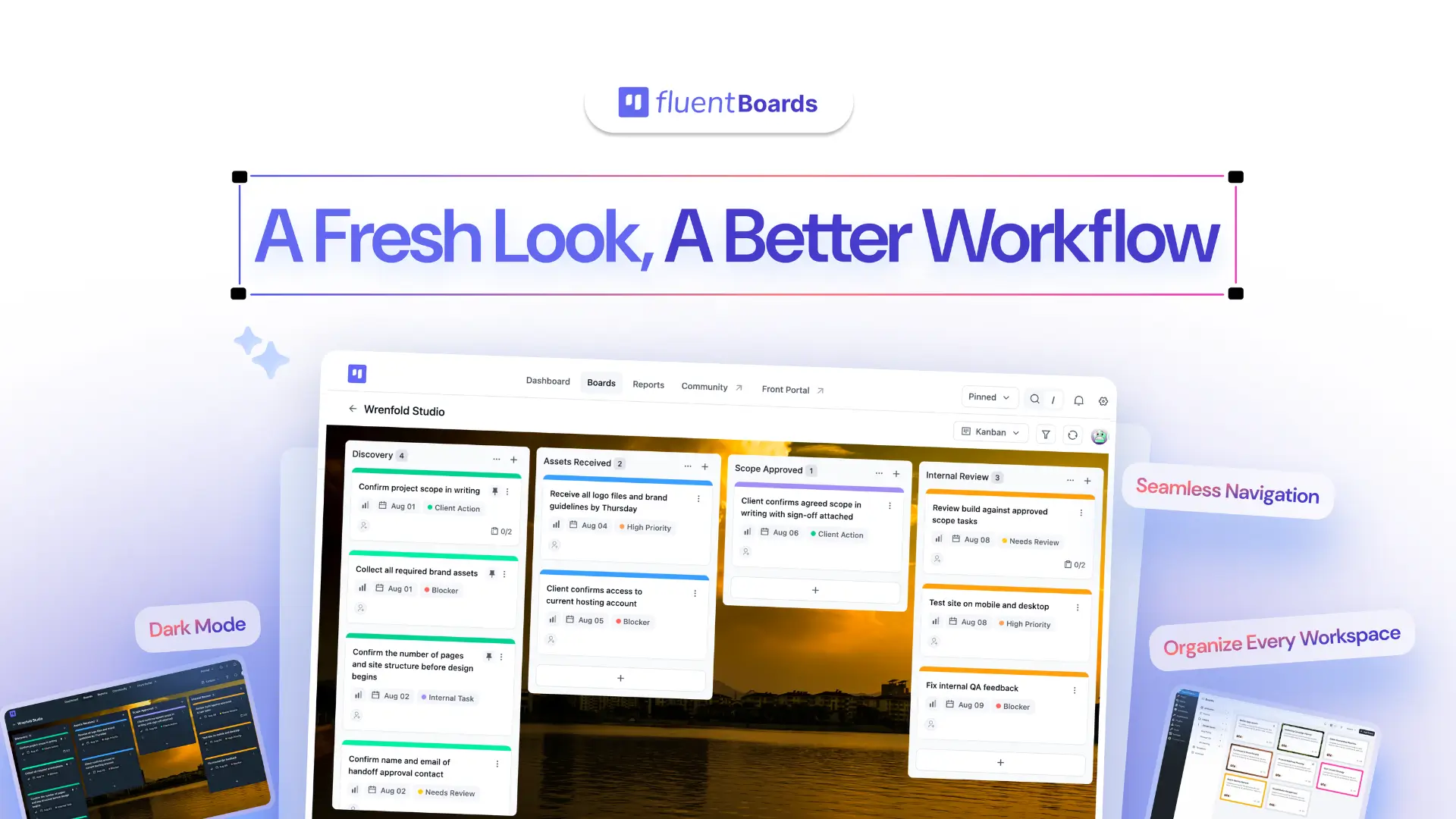
A Fresh Look, a Better Workflow: The New FluentBoards UI & UX


FluentBoards 2.0 is here, and the biggest change is a completely rethought interface.
We already covered the story behind the redesign, so we will not repeat it here.
This post is about what matters most to you: what has changed, screen by screen, and what is staying the same.
Let’s dive in!
Explore Everything New in FluentBoards 2.0
The Rules Behind Every Decision
Before we get into what changed, it helps to understand the thinking behind it.
Every screen, interaction, and visual decision in FluentBoards 2.0 had to pass the same test: does this help people get to their work faster? If the answer was no, it did not make the cut, no matter how polished it looked.
That simple question shaped the entire redesign. Here are the key principles behind every screen.
- Put what matters first: Whether you are managing a simple personal board or hundreds of tasks across multiple projects, the most important information should be easy to spot. You should not have to search for what deserves your attention.
- Remove unnecessary noise: Every screen should feel clear at a glance. That means better spacing, stronger grouping, clearer hierarchy, and fewer elements competing for attention.
- Make common actions easier to reach: Frequently used workflows should take fewer steps. Creating a task, updating work, or finding an important action should feel direct, not buried behind menus and extra clicks.
- Keep the experience consistent: Buttons, dropdowns, controls, and interactions should behave the same way wherever you find them. When the same action works differently across different screens, that creates friction. So consistency became a rule, not a preference.
- Design for what comes next: FluentBoards is still growing, so the redesign had to create room for future features without making the product feel heavier or more complicated over time.
- Improve the experience without disrupting the workflow: The goal was not to make existing users relearn FluentBoards. Familiar workflows needed to stay familiar, while the experience around them became cleaner, faster, and easier to use.
That became the foundation for FluentBoards 2.0: less friction, more clarity, and a product that gets out of your way so you can get to work.
What Changed, Screen by Screen
The real difference will be obvious the moment you start using FluentBoards 2.0. Most of the improvements will speak for themselves as you explore the new experience.
Still, let’s walk through the biggest changes, so you know exactly what is new and where to find it!
1. Dark Mode
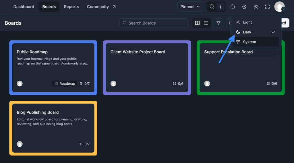
Dark mode has finally arrived in FluentBoards. A built-in Light, Dark, and System toggle now sits right in the top bar. Switch once, and the entire interface follows. Use Dark for late-night work, Light for daytime, or System to match your device settings automatically.
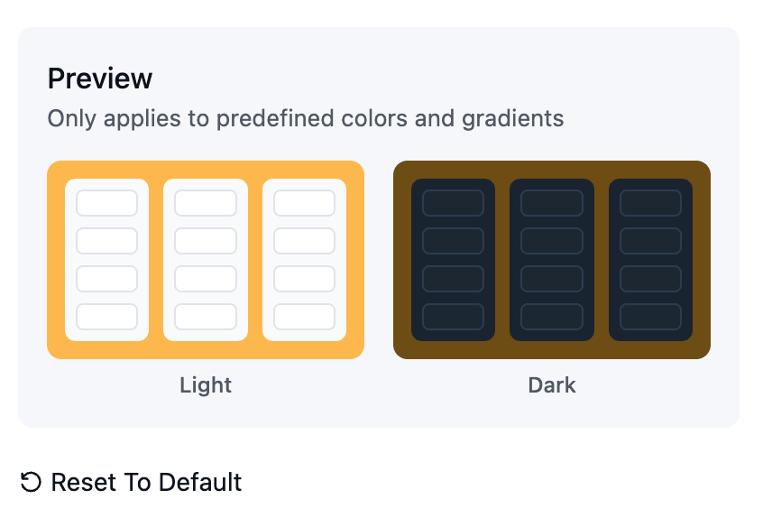
You can also preview the look before making the switch.
Note: Settings now has its own gear icon instead of sitting in the top navigation
2. The Dashboard Briefs You
The dashboard now greets you by name and puts the most important numbers front and centre. Four scorecards at the top show All Boards, All Tasks, Overdue, and Completed Tasks at a glance, so you can see exactly where things stand before opening a single board.
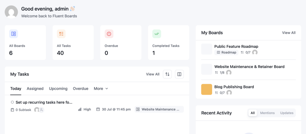
The old board grid has also evolved into a My Boards panel, showing each board’s view type, task count, and assignees, with a View All option when you need to see more.
Right beside it, a Recent Activity feed with All, Mentions, and Updates tabs helps you quickly catch up on what happened while you were away.
3. Finding the Right Board Just Got Faster
The sidebar has grown beyond just All Boards and Folders. It now includes All Boards, Pinned, Folders, Templates, and Archived, each with its own count badge so you can see how many boards sit in each section at a glance.
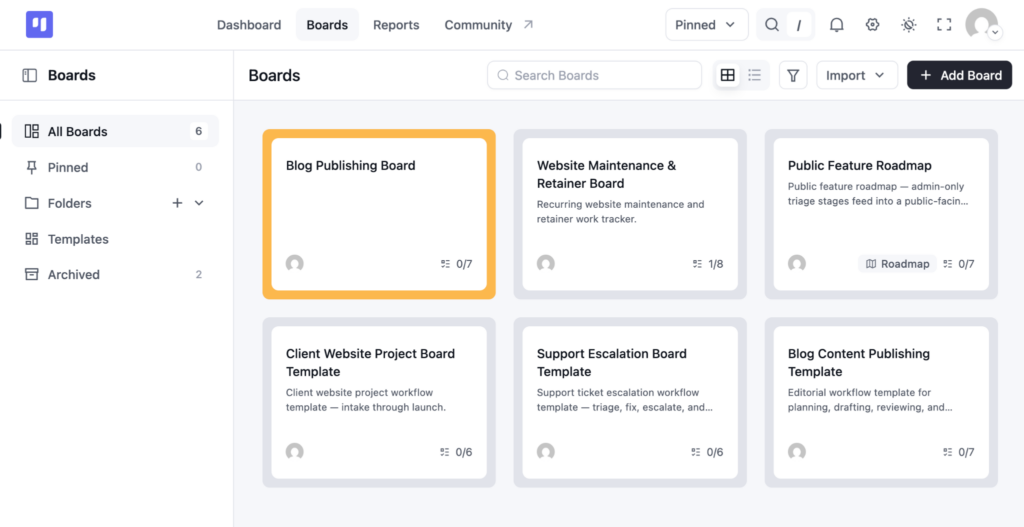
The toolbar has been simplified too. The old Card dropdown is now a straightforward grid/list toggle, while a new Import dropdown sits next to Add Board, making it easier to bring boards in from other tools.
4. Tasks Get Room to Breathe
Here is where you will notice some of the biggest changes.
Previously, tasks opened only as a centred popup over a dimmed background. Assignees, Dates, and Priority sat in one row, Labels below them, followed by the Description, Attachments, and an activity feed split into All, Comments, and Activities.
A permanent action rail on the side kept options like Join as Assignee, Move, Watch, Change Cover, Subtask, Custom Field, Make Template, Recurring Task, Archive Task, and CRM Contact visible at all times.
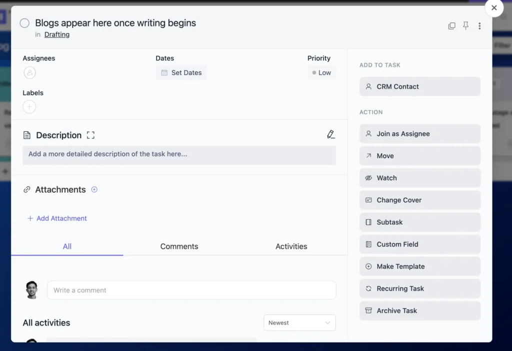
The popup is still available in FluentBoards 2.0, but now you can also open tasks in a full-screen view, like the one shown above. The breadcrumb now shows the full board path instead of only the stage name, giving you better context around where the task belongs.
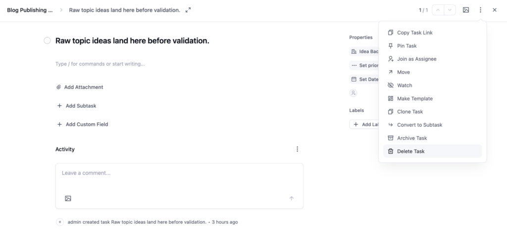
The full-screen view also introduces a handy pager with up and down arrows, letting you move between the previous and next tasks without closing the current one.
The layout itself is much cleaner:
- Assignees, dates, and priority are grouped into a compact Properties section on the right, with Labels sitting just below.
- The description now uses a slash-command editor, so you can simply type / to access formatting and content options instead of searching through a toolbar.
- Add Attachment, Add Subtask, and Add Custom Field have also become simple inline actions beneath the description.
The old action rail is gone too. Actions such as Join as Assignee, Move, Watching, Make Template, and Archive Task now live inside the three-dot menu, alongside new options like Copy Task Link, Pin Task, Clone Task, Convert to Subtask, and Delete Task.
5. Every View, Quieter
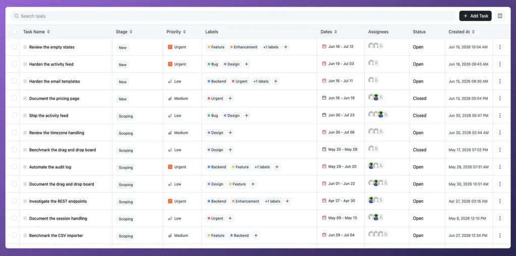
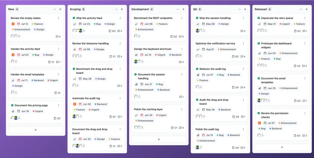
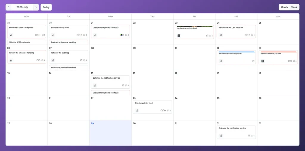
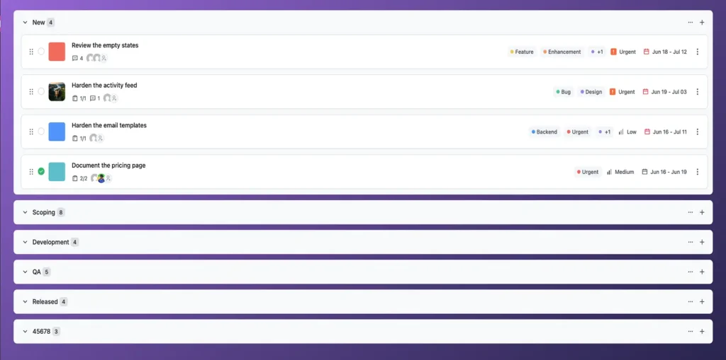
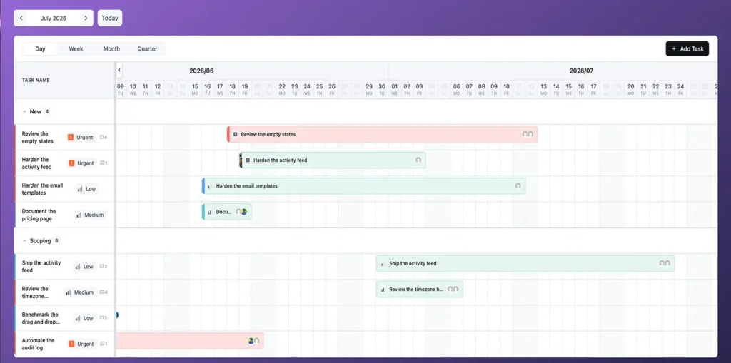
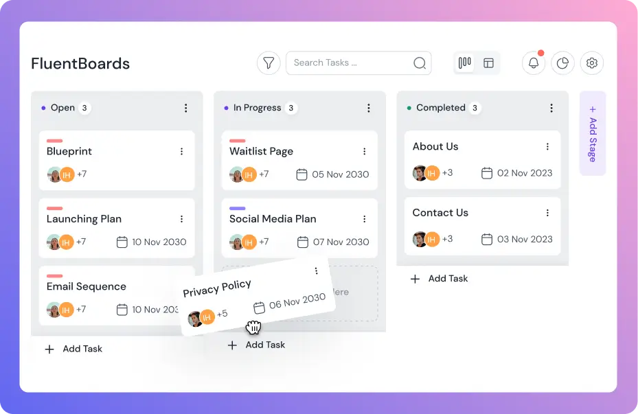
Every project view, Kanban, Table, List, Calendar, and Gantt, has received the same treatment: fewer places to look, more consistent controls, and layouts that stay out of the way of the actual work. Here is what that looks like, view by view:
6. Settings Finally Makes Sense
Settings used to be a flat list of eight separate items: Members Role, Roadmap, General Settings, MCP for AI Agents, Incoming Webhooks, Outgoing Webhooks, Features & Modules, and License Management. There was no grouping, so even closely related options like Incoming and Outgoing Webhooks lived as separate top-level sections.
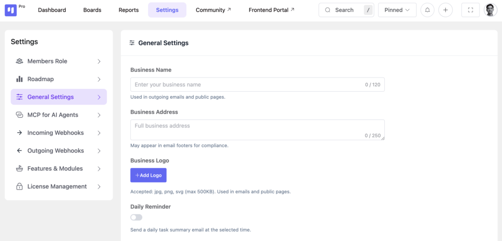
In FluentBoards 2.0, the structure is much more organised. General Settings now leads the list and opens by default, while Incoming and Outgoing Webhooks are grouped under a single collapsible Webhooks section. There is also a new AI Model Setup section alongside MCP for AI Agents.
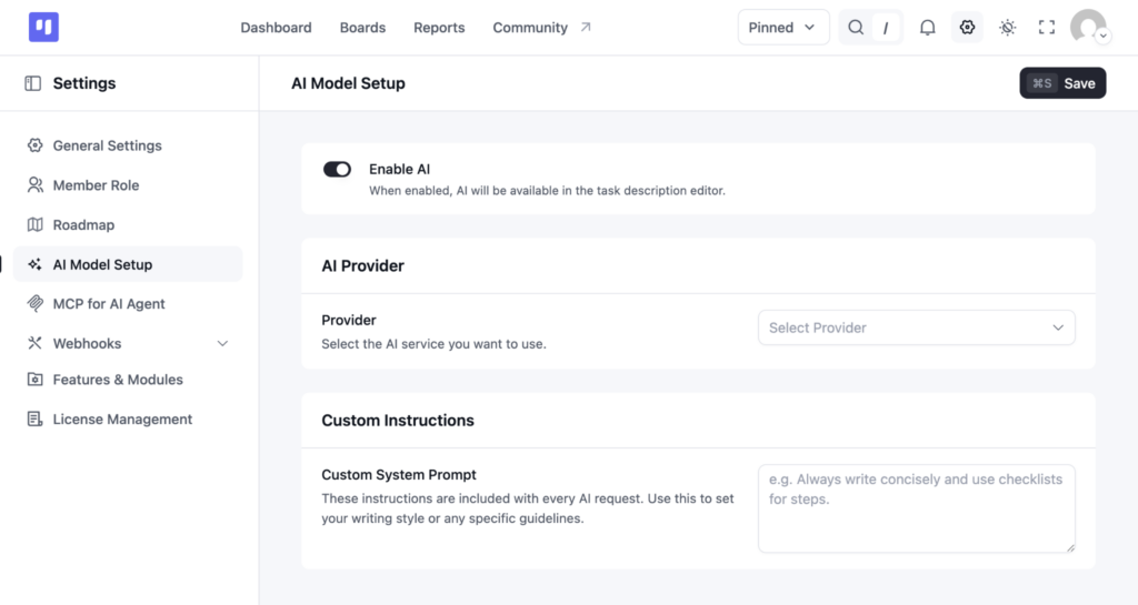
The individual settings pages are clearer too. Every field now includes helper text explaining what it does. For example, Business Full Address notes that it may appear in email footers for compliance. A persistent Save button also stays visible in the top-right corner, complete with a keyboard shortcut hint, so saving your changes is always within reach.
7. Reports Grow Up
Reports used to live on a single flat page with four counters: Incomplete, Completed, Overdue, and Total Tasks, followed by two charts for task completion and priority that you could switch between bar, radar, and pie views.
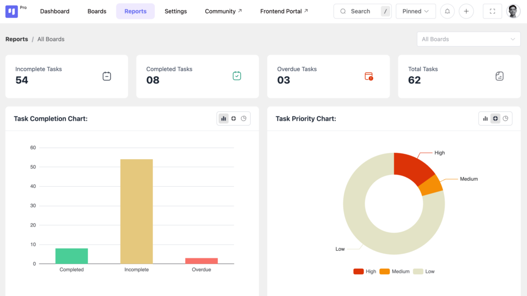
In FluentBoards 2.0, reporting has grown into a much more complete workspace. Reports now has its own sidebar with four dedicated sections: Overview, Tasks, Activity Reports, and Roadmap. The Overview also adds date filtering, so you can look at the last seven days or choose a custom range alongside your board filter.
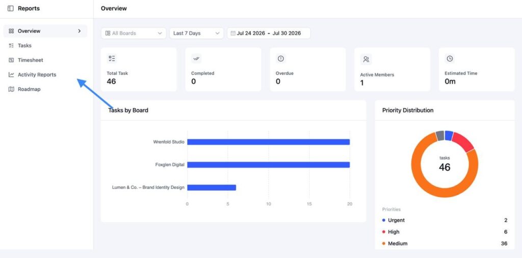
- Overview gives you a quick snapshot of the numbers that matter most
- Tasks takes you deeper into task-level data, showing where work is piling up and how tasks are distributed across team members
- Activity Reports brings project activity together in one place
- Timesheets show how much time you spend on individual tasks
- Roadmap shows how things are progressing, including how many ideas are coming in and how many are actually getting shipped
8. Your Profile Page Gets an Overview Too
Your personal profile page has received the same treatment.
Previously, the sidebar was a flat list of Tasks, Activities, Notifications, and Layouts. Your name and email sat above a row of task filters for Assigned, Upcoming, Overdue, Mentioned, Completed, and Others, along with sorting and board filtering options.
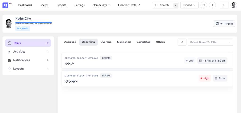
In FluentBoards 2.0, the sidebar now sits under a dedicated Profile section, with Overview added as the new starting point.
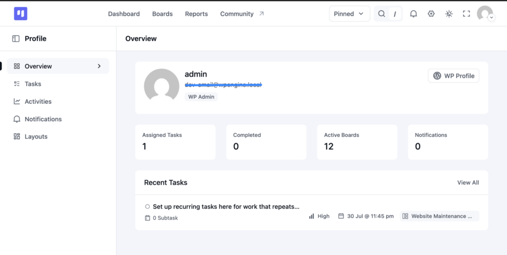
Overview turns your profile into a personal dashboard. Your profile information appears at the top, followed by four scorecards for Assigned Tasks, Completed, Active Boards, and Notifications. A Recent Tasks panel also gives you a quick look at what needs your attention, with a View All option when you want the full list.
The Tasks tab is still there for deeper filtering, but Overview now gives you the bigger picture the moment you open your profile.
Most Importantly: Nothing You’ve Built Gets Lost
If you are already running real projects in FluentBoards, there is one thing worth repeating: nothing you have built is going anywhere.
This update changes the experience around your work, not the work itself. That means all of this stays exactly where it belongs:
- Your boards and how they are organised
- Every task, subtask, and comment thread
- Your folders and pinned boards
Open one of your boards after the update and it will still feel familiar. The foundation has not moved. We have simply made the space around it cleaner, easier to navigate, and more consistent.
If anything does not feel right after the update, our support team is always ready to help. Just submit a ticket, and we will take it from there.
Open your boards and enjoy the new view
This redesign was never about making FluentBoards look different for the sake of it. It was about building an experience where future features can make the product more powerful without making it more complicated.
The cleaner navigation, calmer screens, and unified design system are not just improvements for today. They create room for what comes next. And in some of the fastest-growing areas of FluentBoards, especially task management and reporting, that room is already there waiting to be filled.
Now it is your turn.
Update FluentBoards, open your busiest board, and spend a minute with it. The redesign will probably explain itself better than this blog ever could.
Explore, experiment, and tell us what feels great and what could be even better.
FluentBoards 2.0 was shaped by feedback from people using it every day, and that same feedback will continue shaping what comes next.
Thanks for being part of the journey.
.
Let’s redefine project management with FluentBoards!

Follow:


Get Tips, Tricks, & Updates
We won’t send you spam.



Leave a Reply