

Inside FluentBoards 2.0: The Story Behind Our New UI & UX


When FluentBoards first launched, the goal was simple: build a project management solution that feels at home in WordPress!
No unnecessary complexity. No endless configuration. Just a clean workspace where teams can plan projects, collaborate, and keep work moving.
Over the last two years, that simple idea has grown into something much bigger!
With every update, FluentBoards became more capable, helping teams manage increasingly complex projects without ever leaving WordPress. And, along the way, one thing became increasingly clear: the interface was no longer keeping pace!
No, nothing was broken! In fact, thousands of teams were using it every day. Still, we knew the experience could and should be better.
And that’s exactly what we’re bringing with FluentBoards 2.0.
Why Change Something That Already Works?
It’s a fair question. We asked ourselves the same thing before committing to this redesign! And the answer comes down to three simple reasons.
Great Products Don’t Stop at New Features
Adding new functionality is exciting. It gives users more ways to solve problems. But every feature also introduces another decision, another interaction, or another place to look. And over time, even a thoughtfully designed application can begin to feel busier than intended.
That’s exactly what happened with FluentBoards!
Over the last two years, every release has expanded what teams can accomplish inside FluentBoards. We’ve introduced new views, integrations, automations, time tracking, recurring tasks, AI capabilities, and much more. Consequently, as more features found their place inside the product, FluentBoards started to look a bit more complex than its initial version.
And that’s when the bells started ringing!
FluentBoards was never meant to be feature-rich at the expense of usability. We’ve always wanted our features to be easy to discover, easy to understand, and effortless to use.
So, instead of waiting until FluentBoards felt completely overwhelming, we decided to redesign the experience (Yes, obviously while keeping everything you already love intact)!
We Wanted to Design It Around Your Workflow
The best design decisions rarely come from following trends. They come from understanding how people actually work, where a tool fits into their workflow, and what they expect from it.
When we first started, that piece of the puzzle was missing!
Yes, we did our homework! We ran beta tests, gathered feedback, and refined the product based on what our early users told us. But there was still only so much we could learn before seeing how thousands of real teams used it every day.
Today, FluentBoards has more than 6,000 active installations. That means thousands of teams using it in thousands of different ways, each with their own workflows, challenges, and expectations.
Some manage software projects. Some run marketing campaigns. Others organize client work, editorial calendars, product roadmaps, HR processes, and internal operations.
Those real use cases gave us something beta testing alone never could!
They showed us how people actually move through FluentBoards every day, where they slow down, what they look for first, and which parts of the experience should feel more natural.
Despite their different workflows, all these teams share one expectation: project management software should stay out of the way. You shouldn’t have to think about where a button lives or spend time searching for your next action. The interface should feel intuitive, helping you focus on the work instead of the tool itself.
And that understanding became the foundation of FluentBoards 2.0.
Over the last couple of years, we’ve listened closely to our users. We reviewed emails, community discussions, feature requests, and everyday feedback to identify common patterns across thousands of real workflows.
Every layout adjustment, navigation improvement, and interaction has been redesigned around those insights, with one goal in mind: helping you get your work done with less effort.
A More Unified Fluent Experience
FluentBoards is a standalone product, but it’s also part of the Fluent ecosystem.
Many of our users rely on multiple WPManageNinja products, including FluentCRM, Fluent Forms, Fluent Support, FluentCart, and others.
When you move from one product to another, the experience shouldn’t feel unfamiliar. Buttons should behave the same way. Layouts should feel familiar. Navigation should feel predictable. The overall design language should create a sense of continuity across the ecosystem.
This UI and UX refresh brings FluentBoards closer to that vision, making it feel more connected with the rest of the Fluent family while preserving everything that makes it uniquely FluentBoards.
What We’re Improving
Rather than redesigning everything for the sake of change, we focused on the parts of FluentBoards people interact with every day.
- Better Clarity: Project information is now easier to scan, whether you’re managing a personal task board or coordinating hundreds of tasks across multiple projects.
- Less Visual Noise: Cleaner spacing, improved grouping, and stronger visual hierarchy help important information stand out while keeping the interface calm and distraction-free.
- Faster Navigation: We’ve streamlined common workflows, so you spend less time searching for actions and more time getting work done.
- More Consistency: Buttons, menus, dialogs, and interactions now follow a more unified design system, making FluentBoards feel more intuitive from one screen to the next.
- Room to Grow: This redesign isn’t just about today. It creates a stronger foundation for the features we’ll build tomorrow, allowing FluentBoards to continue growing without becoming more complicated.
A Glimpse at the New FluentBoards
As we mentioned earlier, FluentBoards 2.0 brings a complete UI and UX refresh. The improvements aren’t limited to one or two screens. You’ll notice them throughout your day-to-day workflow.
Here’s a first look at some of the most important areas of FluentBoards.
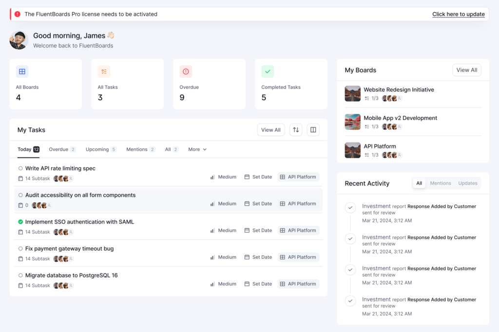
Your dashboard will now be more insightful!
The first thing you will notice after updating is the dashboard. It is becoming significantly more powerful, giving you an at-a-glance view of your tasks, recent notifications, project activity, and recently opened projects. Everything you need to pick up where you left off will be right there.
Managing Multiple Projects Will Be Easier!
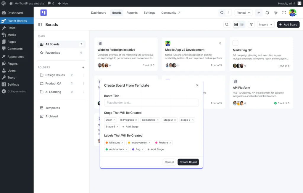
The All Boards view is getting a much cleaner look. The left panel is being reorganised to keep everything accessible, including pinned boards, folders, pre-built and custom templates, and archived boards. We are also simplifying board creation, so starting from scratch or using a template will feel cleaner and completely clutter-free.
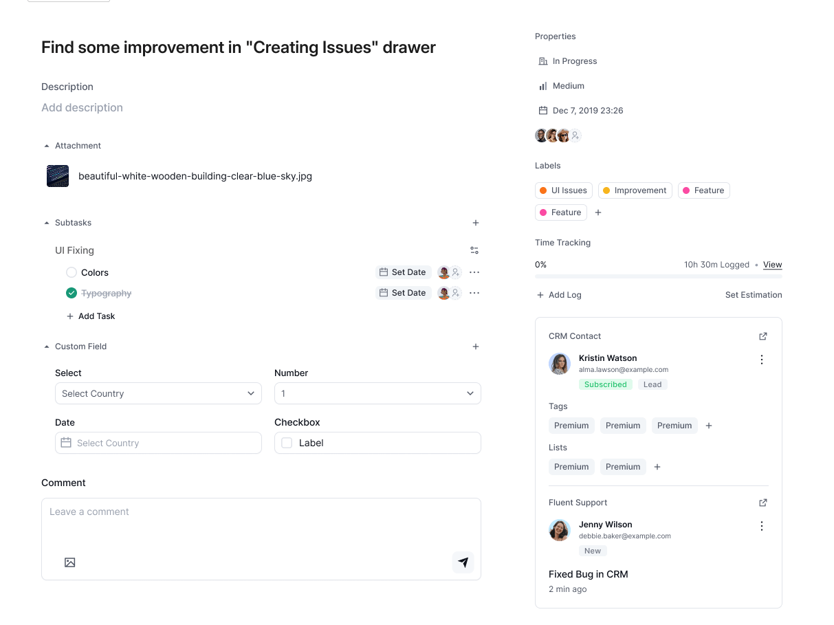
Task Creation and Management Will Feel Effortless
This is where the most meaningful changes are happening and where you will feel the biggest difference in your day-to-day work. We are rebuilding the entire experience to reduce friction, making it easier to create, update, and manage tasks with fewer steps and a more intuitive workflow.
All Project Views Will Be More Refined
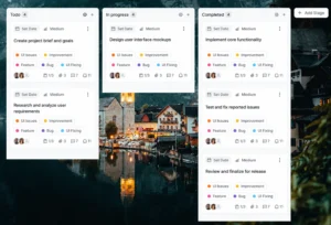
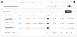
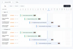
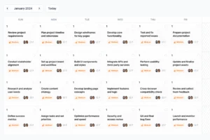
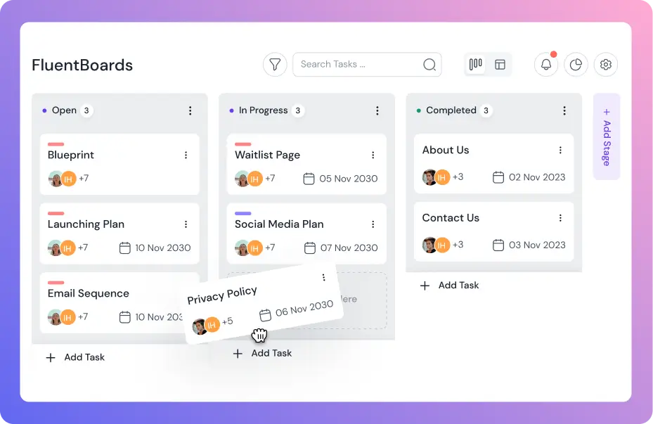
Open any project, and the first thing you will notice is that everything is starting to look and feel better. The Kanban view is getting the biggest glow-up. Cards are becoming more compact, the layout is feeling cleaner, and switching between stages is getting faster. The List, Table, Calendar, and new Gantt Chart views are being refined too. Nothing too dramatic, but everything is becoming sharper, tighter, and more responsive.
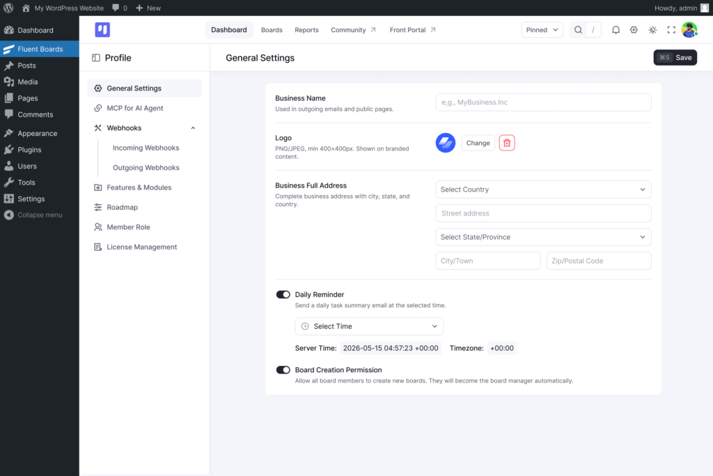
The Settings Dashboard Will Be Easier to Navigate
The settings area is getting a thoughtful reorganisation too. Everything is being grouped more logically, making it easier to find what you need. Whether you are setting up MCP for AI, managing permissions, or configuring integrations, you will spend far less time searching through settings.
And More!
Those are the biggest highlights, but the improvements go beyond the major screens and workflows we have covered. We are also refining the smaller details across the entire interface, including the icons, typography, spacing, and overall visual consistency.
Together, these changes are making FluentBoards feel more polished, cohesive, and easier to use. The result will be an interface that not only looks better but also feels faster, smoother, and more responsive in everyday use.
A Cleaner, Faster, and Smoother FluentBoards Experience
This refresh isn’t about changing things for the sake of change.
It’s about making FluentBoards feel faster, clearer, and more intuitive every time you use it.
We believe project management software should help teams stay organized without getting in their way. FluentBoards 2.0 is our biggest step toward that vision.
We can’t wait for you to experience it.
Let’s redefine project management with FluentBoards!

Follow:


Get Tips, Tricks, & Updates
We won’t send you spam.

Leave a Reply